In the Half Term, I have conducted a plan to complete some extra work.
I still need to upload my questionnaires and complete the graphs and feedback for these, so I shall complete this within the week.
I shall also create my Podcast on how far I am within my media work.
I shall also take some pictures using my own SLR camera and upload them onto my blog.
Thursday, 25 October 2012
Tuesday, 23 October 2012
Research and Planning - Equipment and Software List
Equipment and Software List
Apple Mac
Photoshop
In Design
Blogger
Camera
DaFont.com
------------------------

Research and Planning: Costume and Prop list


Tuesday, 16 October 2012
Research and Planning: Double Page Spread Analysis
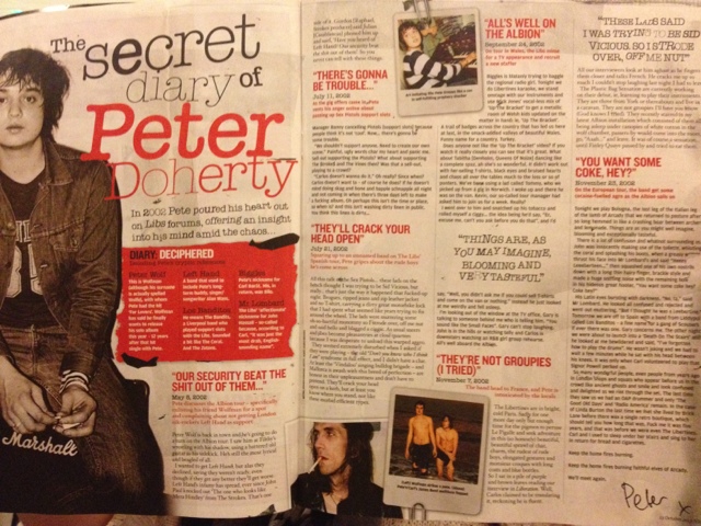
This is my double page spread anaylsis, taken from the NME magazine. This article features the diary entries from the musician Pete Doherty. I have chosen this double page spread as it was more interesting to analyse, because its not simply just an interview, its a diary entry from Pete himself.
On the left page of the spread, there is a semi-middle shot, as the image shows his body posture, and mostly his upper part of his body. By choosing this shot, it allows the reader to understand who the article is about, and what emotions or thoughts they should feel while reading. They have chose to edit the image into black and white, possible to contract with the text, or even to show the persons emotion or mind-set. As the diary entries are very personal, I think the black and white choice is to portray that the diary entries are in "black and white" and there are no hidden thoughts while hes written it.
The style of font chosen for the headline is very mixed, as there is a clash of two fonts in the word "secret" let alone the two other different fonts chosen. This could also infer that the two page spread is going to be linked with a diary post. The choice of red text for "Peter Doherty" has possibly been chosen to make it stand out that the article is soley about him, and not his band
There are six subheadings on the two pages, followed by another underneath with the date each entry was posted. This allows the reader to have more understanding with Pete's mindset, and what happened when. Each subheading is a quote taken from the entries, catching the readers eye and making them want to read more.
There are six subheadings on the two pages, followed by another underneath with the date each entry was posted. This allows the reader to have more understanding with Pete's mindset, and what happened when. Each subheading is a quote taken from the entries, catching the readers eye and making them want to read more.
The layout of the double page spread is very simple and lay out in columns, with added images scattered across the page blending with the text. The images are well placed with suitable backgrounds as they look in the style of a pinboard by using the paperclip.
Overall, I think that the spread fits well into the chosen genre, and appeals to the audience correctly. The same colour scheme kept throughout the magazine makes it look more proffesional and orderly as the house style is kept the same.
Overall, I think that the spread fits well into the chosen genre, and appeals to the audience correctly. The same colour scheme kept throughout the magazine makes it look more proffesional and orderly as the house style is kept the same.
Research and Planning: Contents Page Analysis

My contents page has been taken from the magazine NME. I have chosen this magazine as my main focus point as it has the same genre of music of which I am basing my magazine around. It also has the same audience, so I am using this as inspiration. We can tell that it is from the "indie and alternative" genre as the medium close up photo on the top right of two music legends Simon Niel from Biffy Clyro and Brian Wilson from The Beach Boys. It also has an album cover in the centre of the contents page of a band named The Libertines, which is a main audience focal point, as this is one of the reasons as to why they may have purchased the magazine. The main colours, black and red, are very simple and allows the images to blend well with the text. As the contents page is mainly images and not text like usual magazines, it also initiates to the audience that the music is "different" and not as common. The heading at the top of the contents page is very basic, yet bold. It allows the reader to know what they shall expect from the magazine as they read onwards.
The target audience of this magazine, I expect is to be around the ages of 17-25, as some of the artists and bands are mainly focused around that age group. I get this impression as the image of Pete Doherty on the left hand side is most commonly related to adult outbursts and he is commonly related to alcohol.
The layout of the contents page is very clashy, by this I mean that the overlap of images onto one another portrays the genre. However, there is still a layout of headlines on both sides introducing what they will find on each page.
There is also a "subscribe to NME" offer on the bottom right hand side, allowing readers to become regular purchasers, so they can recieve the magazine through the mail each week.
Overall, I think this magazine portrays the music genre well, and is very simple to read and understand, and I also think that the images are well suited alongside the style of text.
Friday, 12 October 2012
Tuesday, 2 October 2012
Research and Planning: Magazine Mastheads

I have chosen two different names for my magazine of which I can not decide yet which one I am going to use. I have made a final decision on the colour deep red for my masthead as I think it suits my target audience and fits the genre perfectly. The colours I am going to contrast with this is black and white as I think it will be bold and appeals to the audience. The text I am deciding to use is revolution as I think it looks better compared to other texts used.
Subscribe to:
Comments (Atom)